Since the invention of the Web in 1989, a set of standardised best practices for building websites, has evolved. Visitors subconsciously expect you to follow these standards, but many webmasters still don’t get that.
I want to talk about four common front end web standards that still need some attention around the web:
Disclaimer: this is my personal opinion, based on what I’ve learned through the years.
Menus
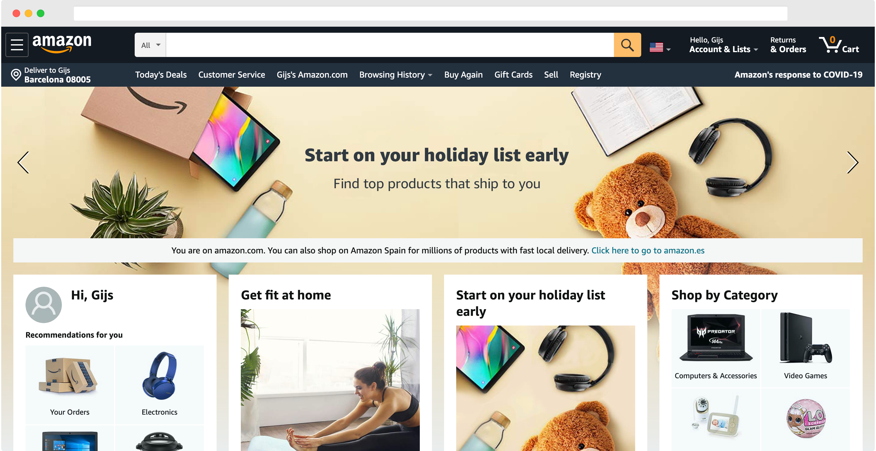
The main menu is the starting point for a visitor to find their way on your website. As to not confuse the visitor, it should be the same on all pages.
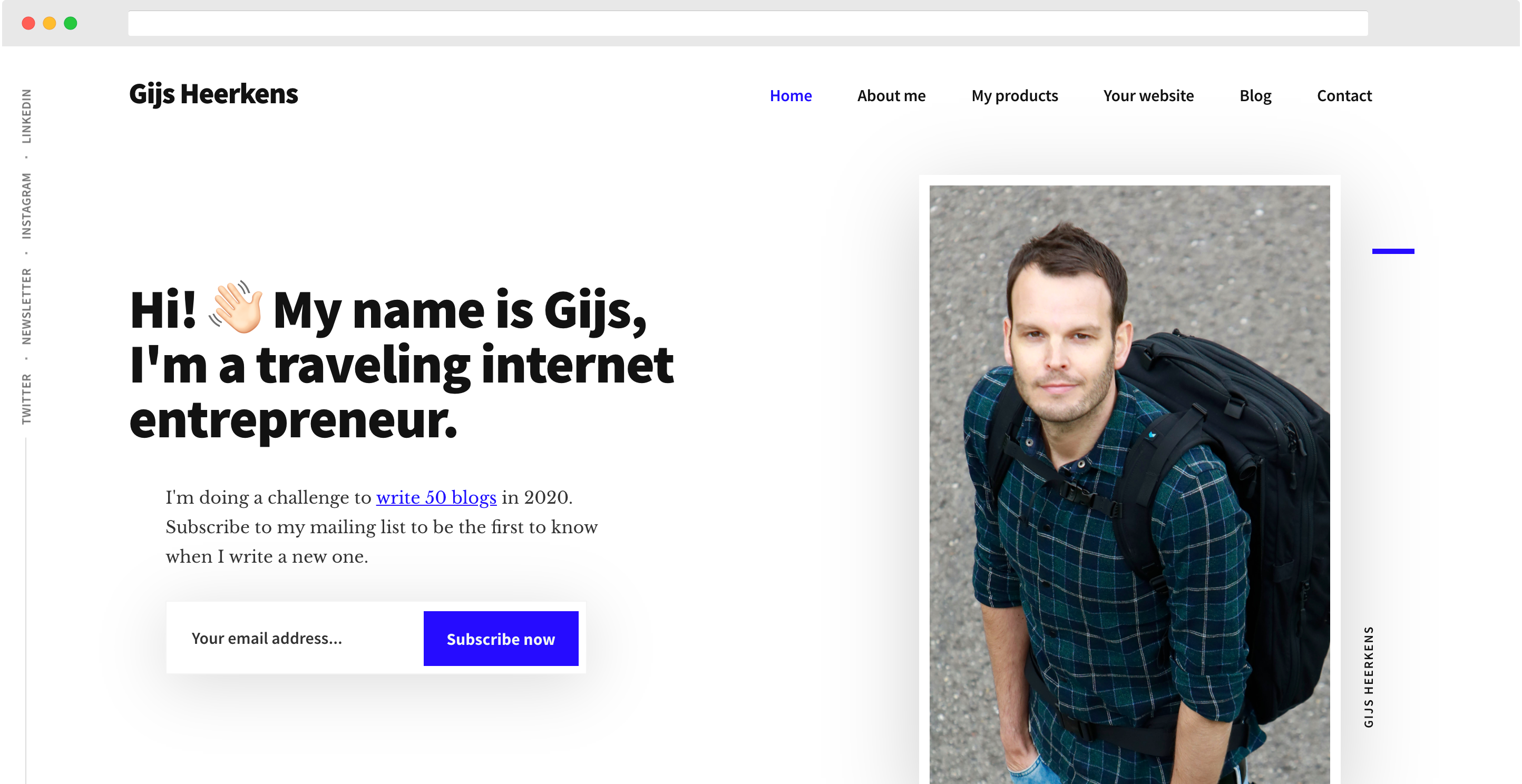
The main menu should be displayed horizontally, in the header bar. The first menu item should always be “Home” and the last men item should always be “Contact”.
Visitors won’t find “Contact” easily if it’s hided in some small secondary menu, and even though everyone knows a logo links to the home page nowadays, “Home” should still appear in the menu.
The most important site sections should appear in the main menu, I’d advice to limit it to five items, excluding “Home” and “Contact”, to keep it clear. You can use foldable submenus below each menu item.
If you have more very important sections, review your site structure. For SEO purposes, your menu structure should correspondent with your site structure. This includes both main and submenu items.
Less important sections can be placed in the footer menu. Don’t expect anyone to use this menu, but it might add some value for SEO.

Buttons
When you look at a web page from a distance, the button should be the first thing you notice.
Buttons guide visitors through your website, and should be consistent throughout the website.
A button should be outstanding in size, font and especially colour. The button should have an opposite colour from your website’s main colour, to make it stand out.
When you buy a standard template, oftentimes the buttons have the template’s main colour. Like in the template I’m using.

Copy
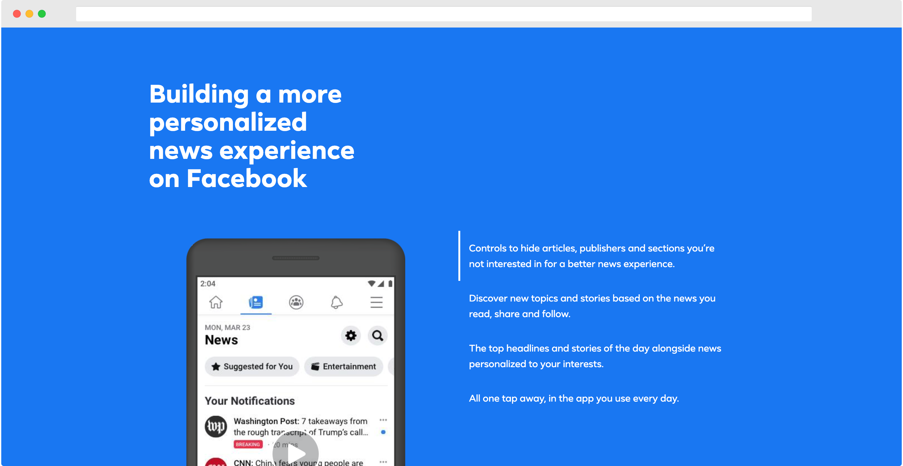
The main task of copy is to convey words to the reader. So you have to make sure it is clearly legible. Big fonts work better than small fonts, even if it “doesn’t look nice”. Beauty is less important than usability on a website.
Black text on bright backgrounds works best to read on a screen.
Font use should be consistent throughout the website in order to not confuse the visitor. Different types of headers should have the same size in all instances to be recognised as such.
Don’t use different font sizes or different fonts for paragraphs all over the website. A smaller font indicates that a text is less important and will probably not being read.
Furthermore, decide how you want to address the visitor. This can be informal or formal, as long as you are consistent (doesn’t apply for English), and it can be plural or singular.

Hyperlinks
On a website, an underlined word implies that it’s clickable. So don’t underline words that are not hyperlinks.
Hyperlinks should get a distinctive colour, the website’s main colour is fine, and be underlined. If you want to do it perfectly, the styling of hovered, visited and active links should be different.

